2010
The "Who Dat?" Biennial
Whitney Museum of American Art
February 23 - May 30, 2010

Adam Weinberg addressing the troops
Tuesday, February 23, 2010. 7:00 PM. In his charming remarks earlier this afternoon during the press opening of the less than charming 2010 Whitney Biennial, co-curator Francesco Bonami (who wistfully regretted how difficult it was convincing artists half his age to have dinner with him) alluded to the intrinsic arbitrariness of all Biennial exhibitions. As an institution just turned 75 years old, and facilitated under the venerable aegis of the Whitney Museum, each particular Biennial, despite its essential claim to showcase the best and brightest art production of the past two years, is still dependent on the whims and prejudices of its organizers. Hence the unavoidable hit-or-miss possibilities of every succeeding exhibition.
There is no cumulative formula for success, as new curators tend to establish new priorities and then select new artists as the avatars of same. If the turnover seems particularly extreme this year, even educated observers of the art scene might feel confronted by a "Who Dat?" Biennial, an exhibition at least partly populated by a fickle and jejune cast of characters.
The continuing arbitrariness is of course a given. But since the Whitney in its wisdom also arbitrarily removed the possibility of my attending the opening night festivities this year, they created an opportunity for me to more immediately jot down my thoughts on the current exhibition: its successes, its failures, and most appropriately its penchant for the arbitrary. I want to thank the museum for the unexpected gift of these last three un-feted hours, without which I would never have been able to pen a review with such alacrity. As an exercise in parallel action, I plan to complete my text in exactly the same time it takes others to quaff the plonk and munch on the chicken satay.
Entering the Whitney this afternoon, several bits of conventional wisdom were already well established. The inclusion of "only" 55 artists, as opposed to previous outings with over 100 participants, defined this as the Recessional Biennial. By being named just for its year, 2010 also became identified as the "no-theme" Biennial. A majority of participating female artists this year, for the first time ever, thrilled certain tabulators obsessed by sexual parity. And the inclusion of an "historical" fifth floor and mezzanine, which includes a time line and a survey of art by previous Biennial artists drawn from the Whitney's permanent collection, ostensibly lends the total exhibition a more "balanced" overview.
Thin and Thinner

The whittled down size of the current show is given a witty objective correlative in the work of David Adamo, whose canes, baseball bats and other wooden objects are systematically hacked into skeletal, vertically skewed versions of their former selves. The resulting wooden shavings and sawdust are allowed to accumulate at the base of each object. Axes, knives, sledgehammers and other implements are prominently displayed or impaled directly into the museum walls. An empty "violin case", without its expected Mafia machine gun, heightens the implications of cartoonish violence. There is casual cruelty and a sense of arbitrary abuse associated with Adamo's gesture, hints of an offstage performance that preceded the display of the work.

The "skeletal" impulse of Adamo continues in the same gallery with Baby by Thomas Houseago, a white figurative sculpture that is similarly rough and "unfinished", revealing in its layered materiality the structural underpinnings of synthetic wallboard, wood, hemp, charcoal and steel rebar.

Completing this skeletal theme are photographs of folding chairs by Emily Roysdon, their colored circular seats and tubular legs delineating an airy, abstract structure.
Shared Themes

The best galleries at the Whitney create shared concerns among artists, an intimation of zeitgeist essential even in a "no-theme" Biennial. For example, the biomorphic, expressionistic, ungainly weirdness established in a central sculpture by Huma Bhabha in a second floor gallery is echoed in surrounding paintings by Verne Dawson, George Condo, Aurel Schmidt and the fiercely subversive graphic panels of comix iconoclast Robert Williams.

On the fourth floor, an interesting gallery combines the photo collages of Lorraine O'Grady, juxtaposing images of Michael Jackson and Charles Baudelaire and their countervailing creative biographies - the latter had a "secret" mulatto wife - with an installation by the Bruce High Quality Foundation collective that also examines discontinuities and contradictions of American identity. A white 1970s Cadillac ambulance (similar to the vehicle used by Joseph Beuys in his famous "I Like America and America Likes Me" performance with coyote at the Rene Block Gallery) forms the centerpiece; a video is screened on its windshield, combining images from newsreels, films, YouTube and TV commercials with a rambling, pensive, overdubbed text on "America passing out on the couch". (More on the Bruces in a future article - their 2010 Brucennial invitational is opening in SoHo in just two days). This sort of conflation, a postmodern lecture with a social/aesthetic continuum, indicates a genuine potential for thoughtful curating.

Unfortunate Gigantisms
But such thematically organized rooms, offering compelling degrees of synergy and cross fertilization, are few and far between. Most work resounds with hollow, empty signification, vainly chasing after relevance. For example, there are gargantuan pieces right off the various elevator lobbies that scream "blockbuster". On the fourth floor, a 40-foot-wide, monstrous cosmology of macrame anchored by a red (Polish?) blot of a planet by Piotr Uklanski. A similarly oversized, digitally realized, woven fantasy of smoke and mirrors by Pae White on three.


On the second floor, two somewhat smaller scaled and more aesthetically pleasing chromogenic prints by James Casebere, depicting tracts of houses viewed from above, but not in fact photographed from "real life" - rather from tabletop maquettes constructed by the artist.


The Casebere pieces, at least, find an unintentional rhyme in a room of small oil paintings on panel by Maureen Gallace depicting the peaceful, geometric forms of grouped beach houses, barns and sheds, suggesting the quiet discipline of still life as applied to landscape.

There is a huge gallery filled with Charles Ray flower ink prints on paper that - however much one might prate about deconstructing Warhol and exploring devolved generations of imagery - made me miss the genius of Ray's conceptual sculptures.

The decision to place all video work on the third floor initially seems like an enlightened curatorial stance, but it actually results in architectural disaster, creating peepshow corridors with portals opening on "attractions" to the left and to the right: here a crisply contoured video by Josephine Meckseper, there a double screen projection by Kerry Tribe, and over yonder an installation of feminist images projected against a jerrybuilt wood/sheetrock corral by Sharon Hayes.


Angelheaded hipsters ... looking for an angry fix
My predominant memory from this afternoon's press opening was watching my fellow critics wander about in a daze, lulled into a dissatisfied stupor by the collective mediocrity, searching for something nourishing to fix on, "burning for the ancient heavenly connection to the starry dynamo in the machinery of night", as Allen Ginsberg might have put it, but instead finding revelation sorely lacking at the Whitney. They hopefully questioned each other - "Seen anything yet? Anything?" - but generally came up short.
I actually quite liked the big Robert Grosvenor installation, a bipartite sculpture with a red, arched, plush element fronted by a circular metal grid. The two forms define a charged space that is easily reinvigorated by subtly changing one's position in the room.
But many of the critics I spoke with just couldn't get behind it (or in front of it). Might it have worked better for them as an interactive piece, with skateboarders sliding through the arch and over the hump, energizing the proceedings?
The weight of history
Grosvenor had previously been included in the 1968 Biennial. (Actually back then it was called the "Whitney Annual", focusing alternately on sculpture one year followed by painting the next.) Which brings us to the "historical" fifth floor. With strong sculpture by Eva Hesse, Ashley Bickerton, Richard Artschwager and David Hammons, photography by Richard Prince, Philip-Lorca di Corcia, Kenneth Anger and Larry Clark, a Paul Pfeiffer video, a 1950s Rauschenberg combine, and paintings by Rothko, Twombly, Guston and Ad Reinhardt, the permanent collection of work from many past Biennial artists made this year's offerings seem that much more tepid by comparison.
If Less Could Only Be More

Despite this, I would like to single out several artists. Daniel McDonald's constructions, using store bought dolls and figurines that he mischievously alters, enact subversive pop culture reveries. His diorama, on a pedestal, of Uncle Sam and Michael Jackson crossing the River Styx, is a welcome bit of trashy "agitpop". (Yes, without the "r".)

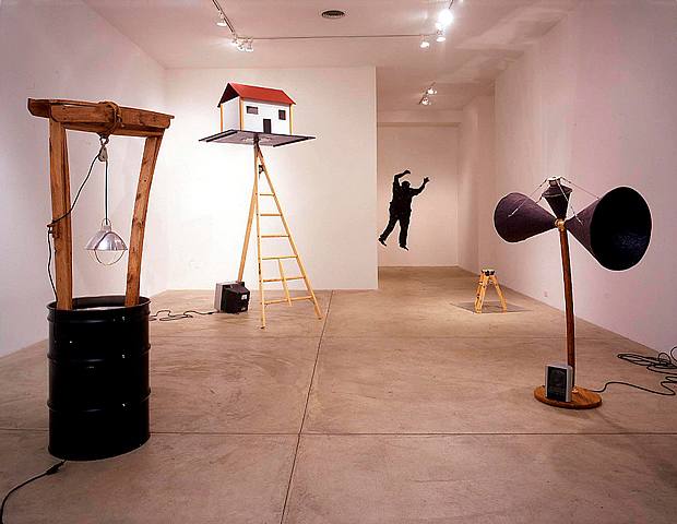
Martin Kersels. His awkwardly unbalanced, roomful sized installation of chairs, platforms, microphone stands and wires implies a strange, fractalized setting for performance that resets our fulcrum and twists us around in disoriented, slapstick surrender.
Aki Sasamoto also has a performance oriented installation, a room where she improvises actions using donuts, square tables revolving into alchemical circumferences, freehand charcoal drawings of circles on the wall, and other mysterious ceremonies that defy conventional logic while advancing obscure mathematical progressions and routines.

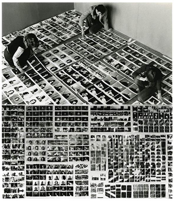
Babette Mangolte's fourth floor room of video and b/w photos, sequestered behind a double black curtain, is a thirty year history of dance and performance, with a wall mounted grid of snapshots of performers as well as other photos mounted in a long, horizontal glass covered vitrine. It resonates as a living document of the avant garde from the 1970s through to the present.
The installation of Theaster Gates, in the submerged Whitney moat, could only be seen from behind a locked glass door during the press opening. We could view it from a distance and also hear a chant that seemed to emanate from the piece, but it was impossible to fully access it. I assume the door was finally unlocked for the evening opening, but since I was not there I cannot swear to this.
I could undoubtedly say a lot more about 2010, invoking other artists and other themes. But time has run out. The bar is closed, the caterers have stopped serving, the security guards are ushering out the last stragglers. As the Whitney has delimited me, so have I returned the favor. Who knows what the future will bring? Bette Davis once said: "Fasten your seat belts. It's going to be a bumpy night." 10:00 PM


Bonami comments posted on Culture Grrl
Lee Rosenbaum of the Culture Grrl blog also attended the press preview and shot a video of curator Francesco Bonami's opening remarks: